Also in Novels
The Novel Nobody Wanted, Printed at the Author's Expense
Bovary in the Dock
The most recognisable object in French literature is not a book. It is a cover.

What the Eye Sees First
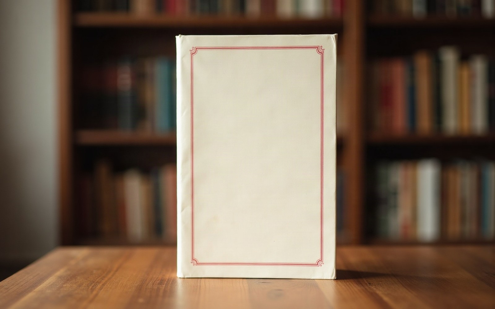
Pick up any novel from Gallimard's NRF list and the cover announces itself before the title does. Cream paper — not white, not ivory, but the particular off-white that belongs to no other publisher — bordered by a thin crimson rule running inside the edges of the board. The title in upper case. The author's name in the same register. And at the foot, discreetly, the letters NRF inside an oval colophon, beside the word Gallimard. The whole arrangement occupies perhaps a third of the cover's surface. The rest is silence.
Gaston Gallimard formalised the house in 1911 from the journal La Nouvelle Revue Française, and the cover came with it — a deliberate refusal of the illustrated, poster-influenced jackets that commercial publishers in France and Britain were already beginning to favour. Where Grasset or Flammarion would eventually experiment with colour and image, the NRF cover said, in effect, that the text required no advertisement beyond its own name. The typographic plainness was a statement of hierarchy: the book was above selling itself.
A Century of Small Adjustments
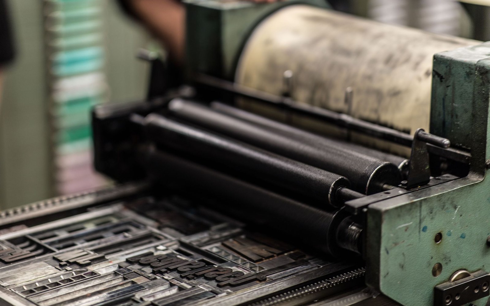
The cover has not been redesigned. It has been adjusted, which is a different thing. The typeface used for the author's name and title has shifted across the decades in response to changing typesetting technology. Early NRF editions used letterpress composition in a roman face with modest serifs; later, as phototypesetting replaced hot metal in the 1970s, the letterforms became marginally lighter and the spacing more open. Digital composition since the 1990s brought the version readers handle today — set in a variant of a classical roman that retains the vertical stress and restrained serifs of the original. None of these changes is visible to anyone not looking for them.
Chronology of small changes
- 1911NRF cover established with letterpress roman type and double crimson filet
- 1970sphototypesetting replaces hot metal; letterforms lighten slightly
- 1990s onwarddigital composition; current version of the classical roman face
The crimson rule — technically a thin double filet, a frame of two lines — has stayed constant in weight and placement. So has the colophon. What the NRF mark confers is something that cannot be faked by imitation: it tells the reader that the manuscript passed through a specific editorial culture, one that ran from André Gide and Jacques Rivière in the early years through Jean Paulhan in the mid-century to the senior editors of the present house. The cover is a certificate, not a design.
What the Object Promises
The livre broché — the uncut, paper-covered French book — has always placed the intellectual burden on the reader: you had to want the book enough to open it with a knife. The NRF cover intensifies that logic. It offers no summary, no endorsement quote, no author photograph, no subtitle amplifying the title's meaning. The Pléiade edition, Gallimard's prestige collected-works series established in 1931 ↗, takes the same instinct further into leather and bible paper; but the NRF paperback makes the same argument at the price of a weekly newspaper.
This restraint has consequences for how the books are read. A novel arriving in that cream wrapper carries an implicit claim — not about quality, which varies across a century of output, but about seriousness of intention. When Albert Camus's L'Étranger appeared in 1942 or Patrick Modiano's earliest fiction in the late 1960s, both objects looked identical in their material presentation to a minor title that sold three hundred copies. The cover does not sort its authors by reputation. It treats them all as belonging to the same editorial project.
What the cover contains (and omits)
That democratic blankness is, of course, itself a kind of prestige. Readers learn to read the cover's refusal to signal anything as a signal in itself. More than a hundred and ten years after Gaston Gallimard registered the design, the cream and the crimson rule still do precisely what they were made to do: they make the book feel as though it has always existed, and always will.